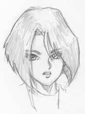
Traditionally,
Anime/Manga characters are portrayed as "lipless". However,
it is possible to have characters with full, even pouty, lips.
The trick is to draw the mouth in the traditional anime way then
apply the lips to it. If you keep the proportions right it will
look good...I'll show you.
|
|
|
Understand
the Shape
The mouth
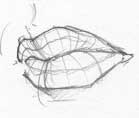
has a "Bow" shape to it. The upper lip is like those
seagulls you used to draw when you were a kid. The lower lip is
more like a Bow from a bow and arrow set.
|
|
|
Open and
shut case
These shape
principles remain the whether the moust is open or shut. However,
The wider open the mouth..the more streched the lip therefore
you should draw it thinner if it is WIDE open.
|
|
|
Step 1:
The setup
Now that you
now the difference between the top and bottom lip we can begin
to apply that to our traditiona anime mouth.
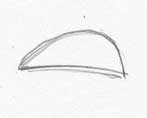
Here's a low detail anime mouth. If there was an upper row of
teeth visible and maybe a small shadow to define the lower lip
we would be done...but we are going to expand on this.
|
|
|
Step 2:
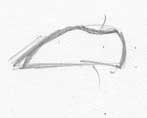
bow in the top lip a bit
Start to work in that Seagull shape to the top lip. Begin to visualize
this as a 3D object. I have made a few centerlines here to help
me define the correct angle of the lips for the next step.
|
|
|
Detailing
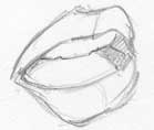
Work in the lips as shown here and in the first 2 pics. Add some
teeth and darken the interior of the mouth (if visible) to give
it some depth.
If you are coloring the piece..it's best define the lips through
color shading. Upper lip should be darker than the lower lip.
|
|
|
Keeping
it "Anime"
Traditionally, if a person is looking straight ahead you could
draw a dotted line from the middle of their eye down their face
and find the corners of the mouth. That's how you would normally
determine width. BUT, since this is anime, Mouths are only as
wide as the inside corner of the eyes (for women).
I intentionally drew this pic in "Ultra-Shirow" mode
since Shirow is one of the few manga artist that actually draw
lips.
Check out Adam Warren's stuff too. He tends to draw lips on his
characters as well ..a little too big sometimes but it still looks
good.
|
